Skeleton of Order: Understanding the Grid System for Layout
The Grid System is the basic foundation of graphic design, UI design and typesetting. It is a set of invisible horizontal and vertical guide lines that divide a page into regular sections. These lines help us arrange text, pictures and graphics in an orderly way. Many people think grids are rules that limit creativity. In fact, their real job is to bring order to a layout, sort out content priorities and keep the design consistent, making it clean, professional and easy on the eye.


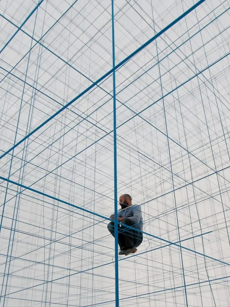
1. Common types of grids
We use different grids for different content and uses:
- Single-column grid: One full-width block, with horizontal lines keeping text steady. Great for simple posters and poetry books, so viewers focus on the main message.
- Multi-column grid: The page is split into 2 to 5 columns. Columns can be equal or unequal in width. Equal columns look neat; uneven columns help highlight key content. Magazines and web pages often use this style.
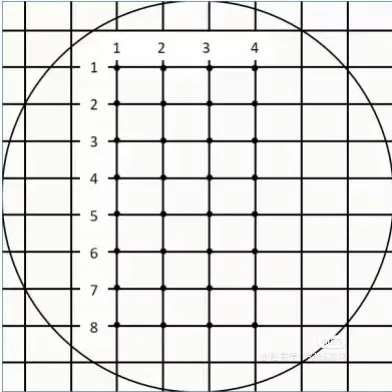
- Modular grid: Divided both horizontally and vertically, like a chessboard. Ideal for newspapers, brochures and product pages. It keeps lots of text and pictures well organized.
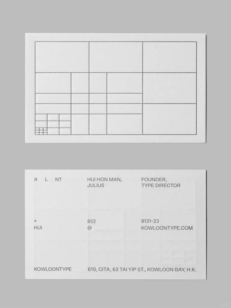
- Hierarchical grid: Sections do not need to be the same size. Important content gets more space, while minor content takes less space. It draws the viewer’s attention quickly.
- Baseline grid: A shared horizontal line where the bottom of every line of text lines up. Perfect for books and manuals with large amounts of text for smooth reading.
- Radial grid: All elements spread out from one central point. It creates strong visual impact and works well for creative, eye-catching posters.


2. Core rules for working with grids
Grids are not meant to be followed rigidly. Keep these simple ideas in mind:
- Grids serve the content: A grid is only a tool, not the final goal. Do not make your content hard to read just to fit the grid. You can break the grid occasionally as long as the whole layout stays balanced.
- Proportions matter: The width of columns, gaps between elements and text sizes decide whether the layout looks good. A consistent set of sizes makes the design harmonious.
- White space is part of the design: Empty space planned by the grid is not wasted space. Proper white space prevents clutter and gives the design a cleaner, more premium feel.
- Alignment unifies the layout: If items line up to the same guide line, they feel connected as one whole, even when they are far apart.


3. How to build a grid and common mistakes for beginners
You can follow this simple workflow:
- Decide how much empty space to leave around the edges of the page.
- Pick the right grid: multi-column grids for text-heavy work, modular grids for lots of pictures and text. A 12-column grid is widely used for websites because it is flexible.
- Place pictures and text. Content can span several grid sections, but its edges should line up with guide lines.
- Grids are only helpers during layout. They will not show in the final finished work.
New designers often make these mistakes: placing elements randomly without guides; starting with overly complex grids when a simple two-column grid is enough; sticking too strictly to the grid and leaving no room for changes. Learn to balance order and flexibility.


4. Quick grid tips for common design software
- Figma: Select your frame, add Layout Grid in the right-side panel, then set columns, margins and gutters. Press
Shift+Gto show or hide grids. - Illustrator: Draw a rectangle the same size as your artboard. Go to Object > Path > Divide into Grid to set rows, columns and gaps freely.
- Photoshop: Go to View > New Guide Layout to create grids quickly. You can also make your own grid layer for alignment.
5. Grids for printing
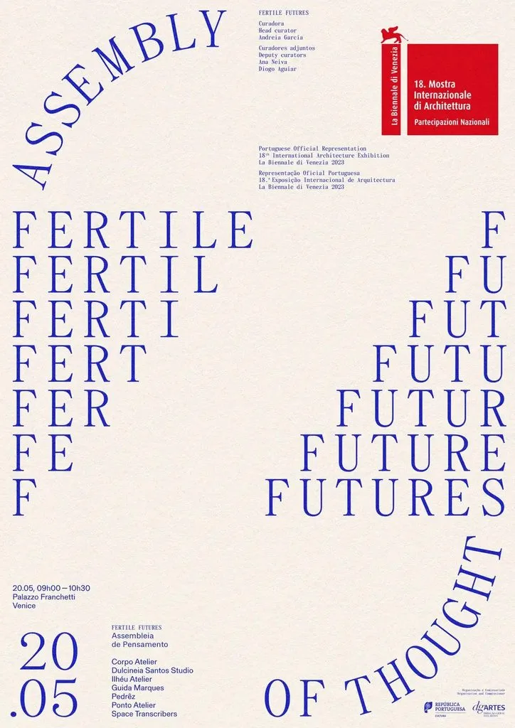
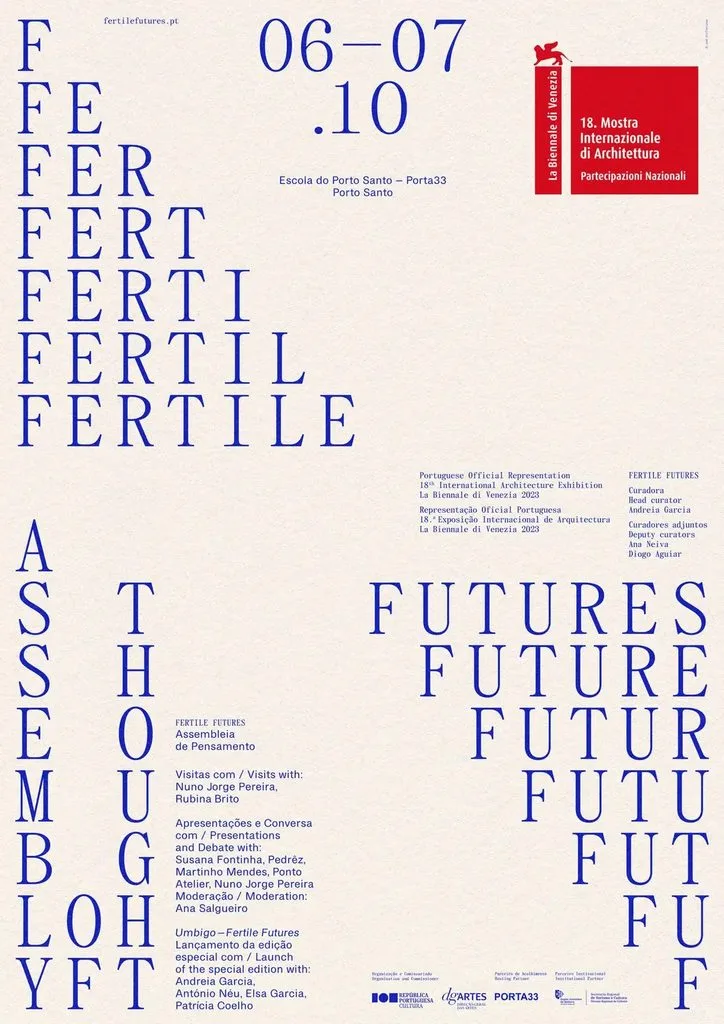
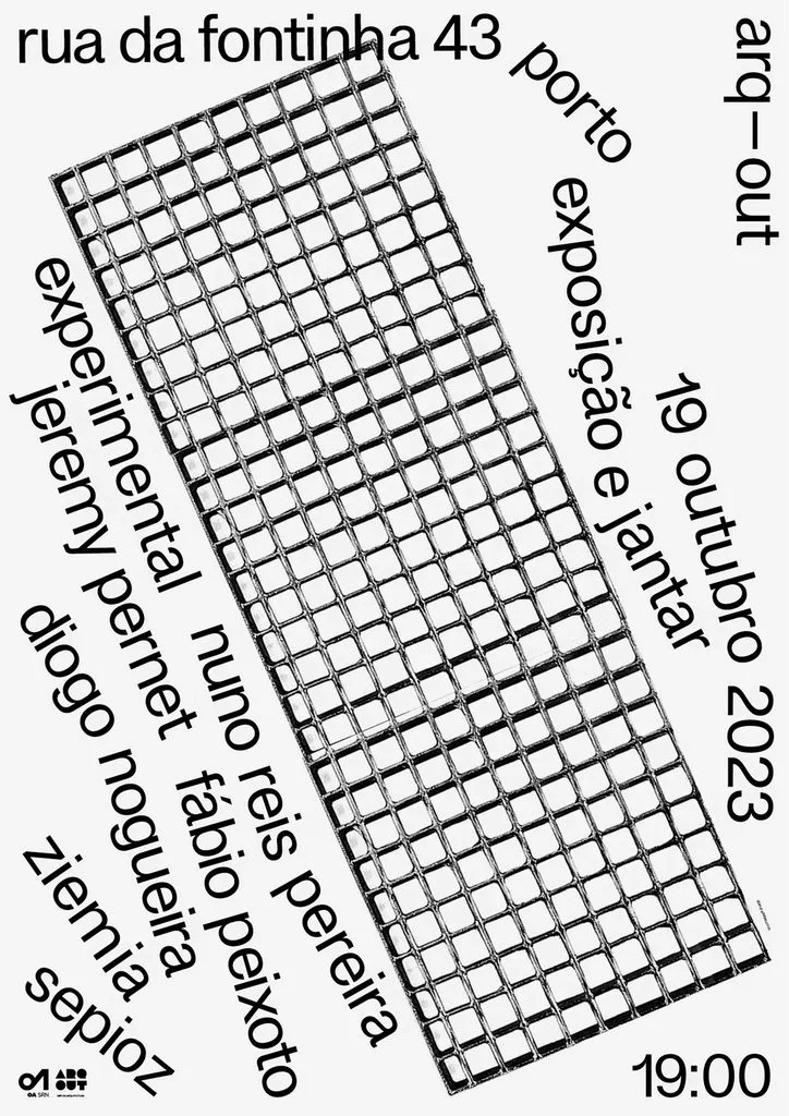
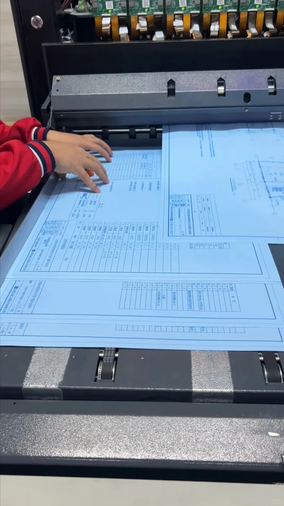
DTF printers, UV printers and dye-sublimation printers work naturally with grid-based layouts. We also use grids a lot when calibrating these machines. We print a standard grid test sheet to check if print heads are misaligned, if sizes are distorted and if colours print evenly. Tiny errors are easy to spot on a grid. This helps make sure your digital layout prints correctly.
The grid system forms the rational skeleton of modern design. It does not hold back creativity; it gives creativity a solid foundation. Once you understand grids, messy layouts become well-organized, and your message gets across more clearly.

6. Common problems with the grid system
Grids are helpful, but they can cause trouble if you are not careful. The most well‑known mistake is sending files to print without hiding the grid. The grid lines get printed on your finished work and ruin the product. There are other common issues too.
Some people set grids that are too big or too small, so layouts look cramped or scattered. Sometimes the grid does not match the print size. Everything looks aligned on screen, but it shifts after printing. Some users stack too many grid layers at once and lose track of which guide lines to follow.
Grids are only helpers. Always double‑check your file before printing: hide grids and guides, and check your layout again.
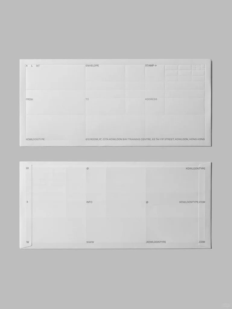
7. The nature of the grid system
The grid system is essentially a visual way of thinking to help us make design decisions, not just guide lines on the canvas. Mastering grids lays a solid foundation for layout. In our next session, we will talk about division layout.